In this article
- 1) Koox
- 2) The Fat Duck
- 3) JB Restavracija
- 4) Darwin & Wallace
- 5) Bresca
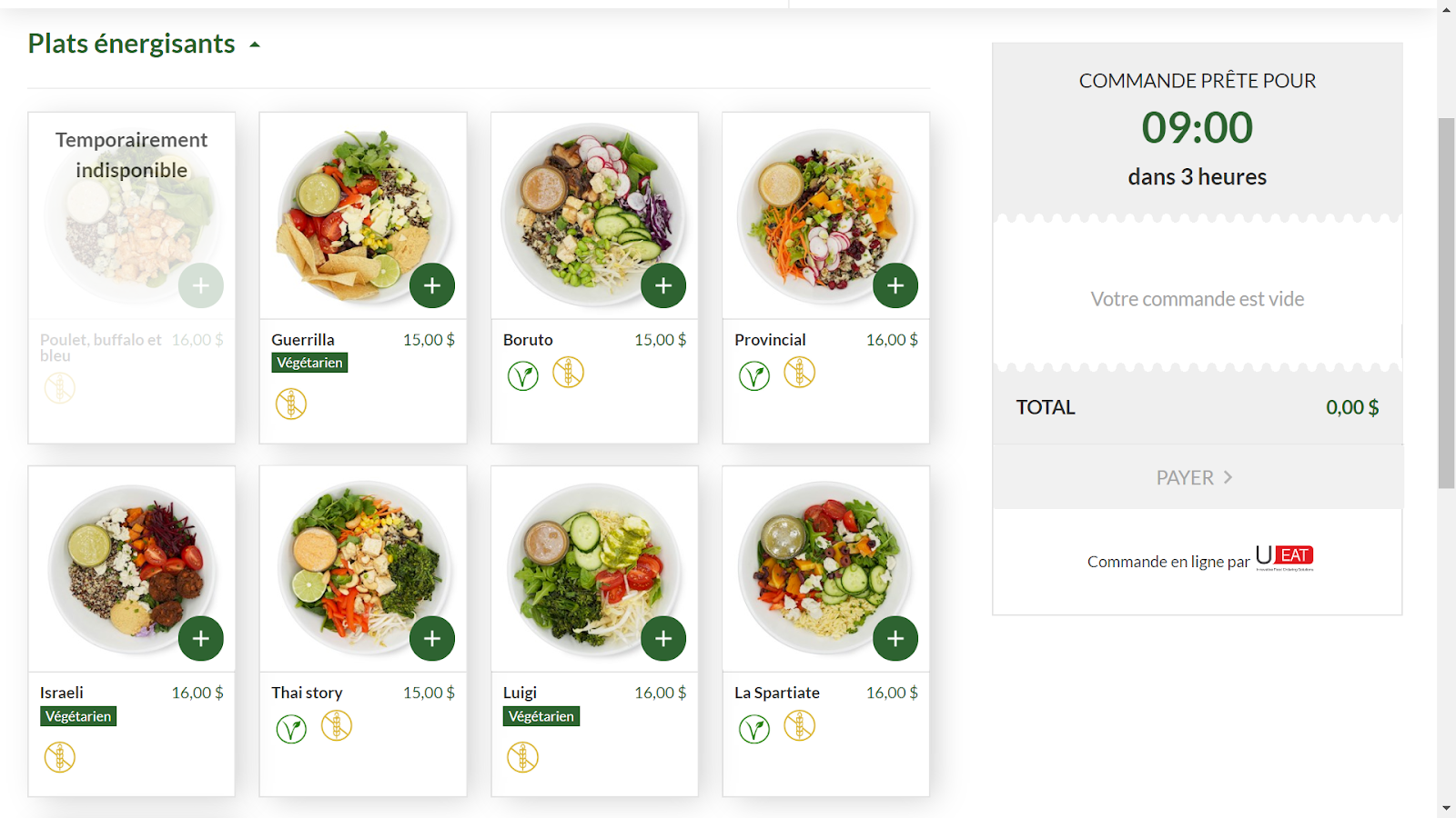
- 6) Restaurant Colibri - Cuisine Verte et Transparante
- 7) Craft and Kitchen
- 8) El Burro
- 9) Quince Restaurant
- 10) Pastaria
- 11) Sliders
- 12) Middle Child
- 13) Malai Ice Cream and Cake
- 14) Top 2000 Online Café
- 15) Simmons Bar
- Conclusion
Website design is a 21st-century art form that is difficult to master. It’s not easy to balance aesthetics and function. These fifteen websites, however, have nailed that elusive balance to create the perfect tool to promote their restaurant brand.
In other words, feast your eyes on these jaw-dropping masterpieces and be inspired!
1) Koox
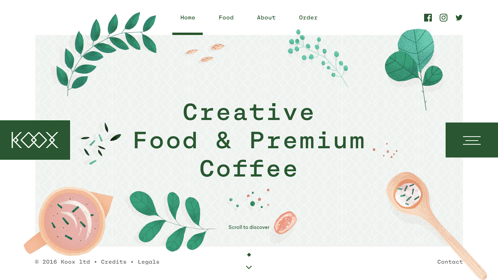
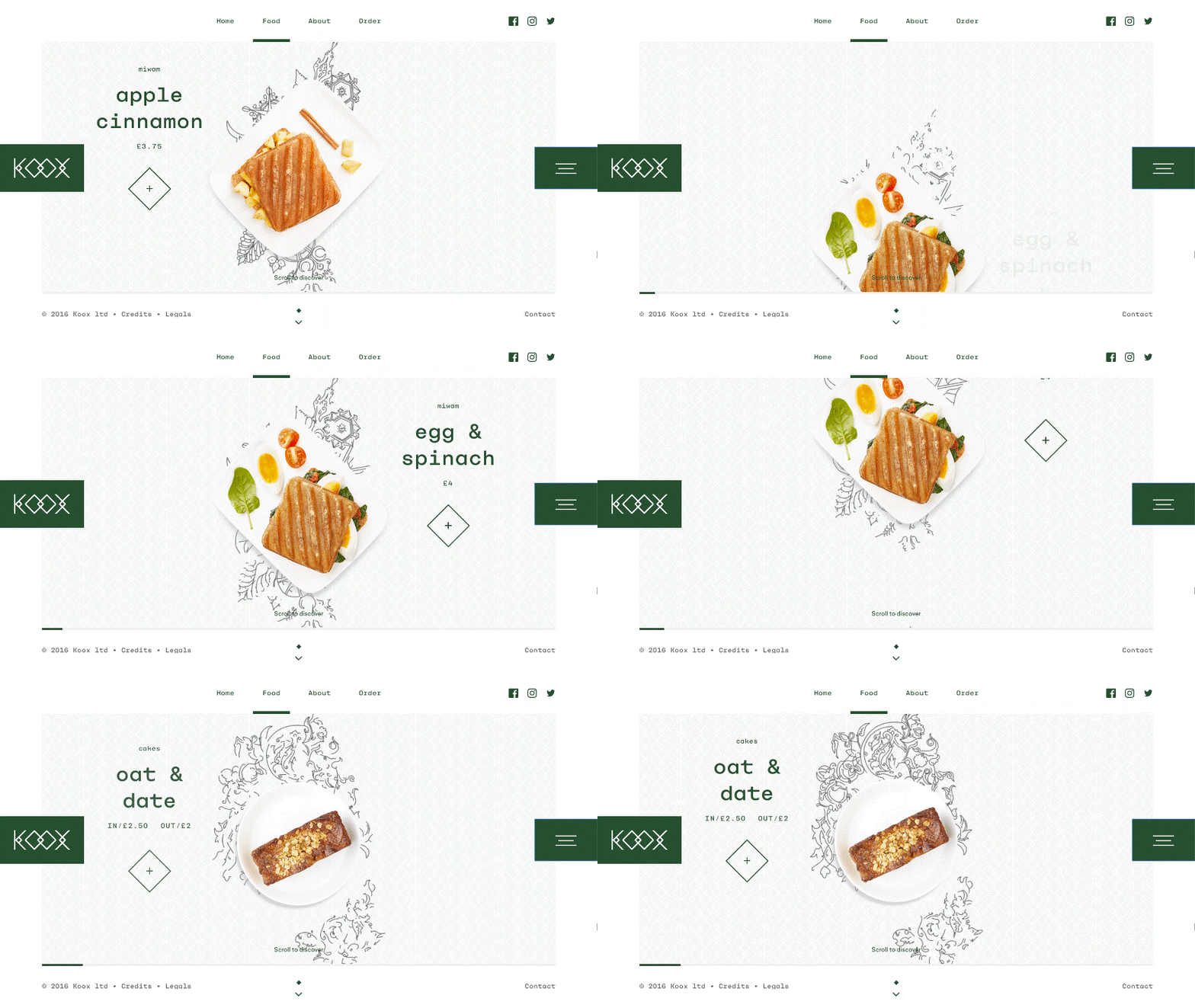
Koox, located in central London, creates an exquisitely clean-yet-warm aesthetic by using a combination of plenty of white space with soft-toned green and orange drawings of food. It’s a great example of using colour to create a consistent design throughout a website. Even the images of the food on their menu match the colour palette.
2) The Fat Duck
Heston Blumenthal, head chef at the Fat Duck, is world-famous for his innovative food – his dishes often hide delightful surprises – for example, a chicken liver and foie grass parfait which looks exactly like a mandarin orange. The Fat Duck’s website has been brilliantly designed to match this expectation.
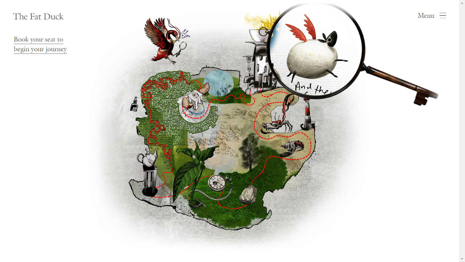
At first glance, this website seems a bit too plain – just a map with an Alice in Wonderland theme – but upon closer inspection (with the giant magnifying glass), you find oodles of small details hidden in the map on the home page. It’s easy to spend several minutes watching the map change through the magnifying glass, adding to the restaurant’s reputation for delivering surprises.
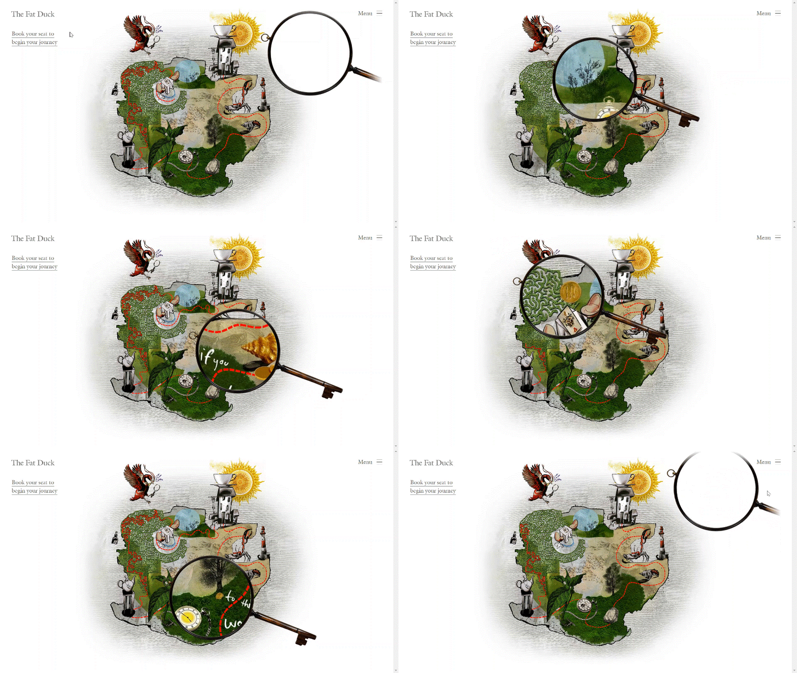
The takeaway: using an interactive element is a great way to make your website more memorable.
Check it out here The Fat Duck
3) JB Restavracija
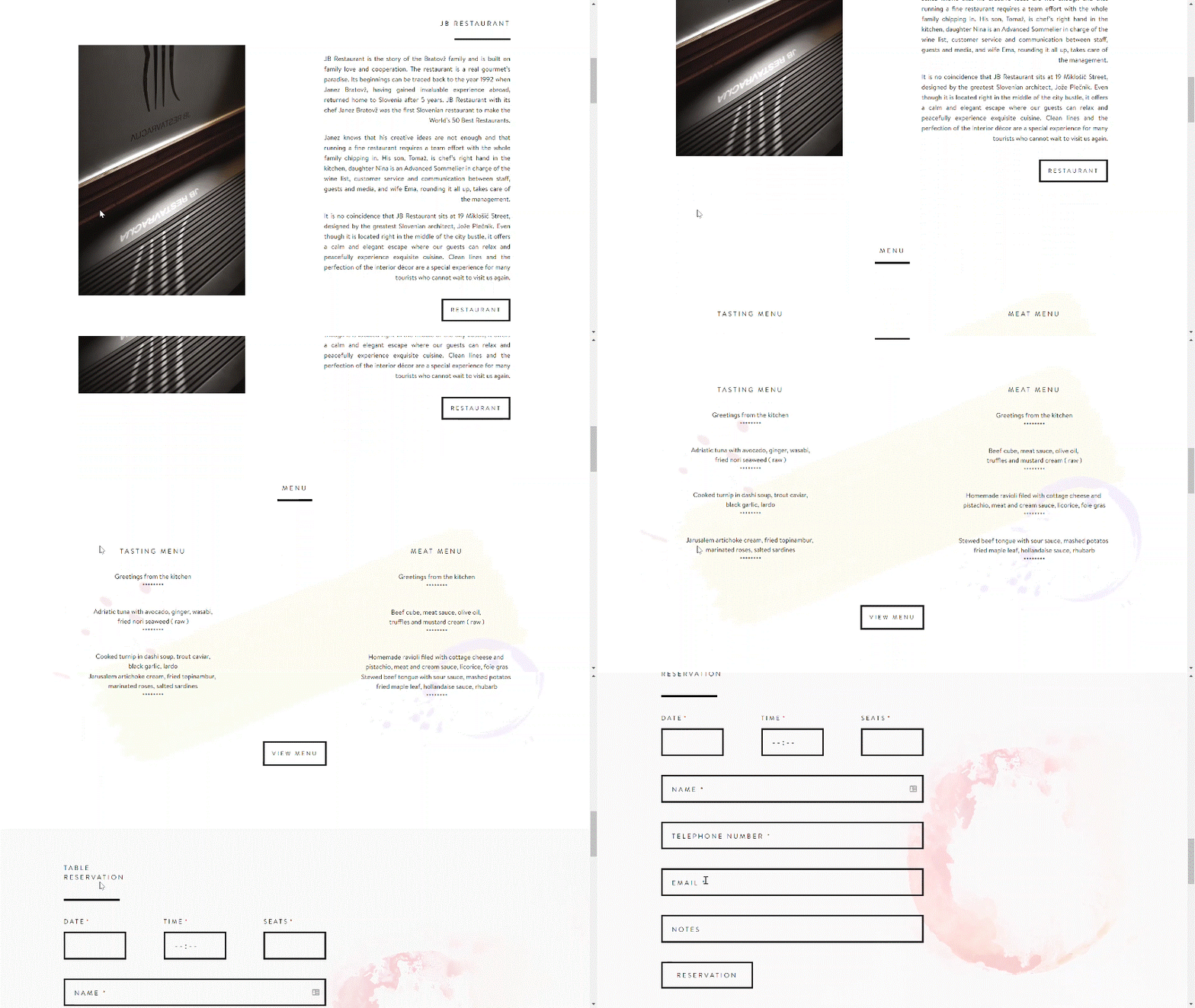
Janez Bratovž, master chef and author, runs JB Restaurant with his family in Slovenia. With a clean and simple design, his website draws all its viewers’ attention to the food. The backgrounds are white with light, watercolour designs and plain black text. This makes the images of their food the sharpest and brightest colours on the page, naturally making them stand out.
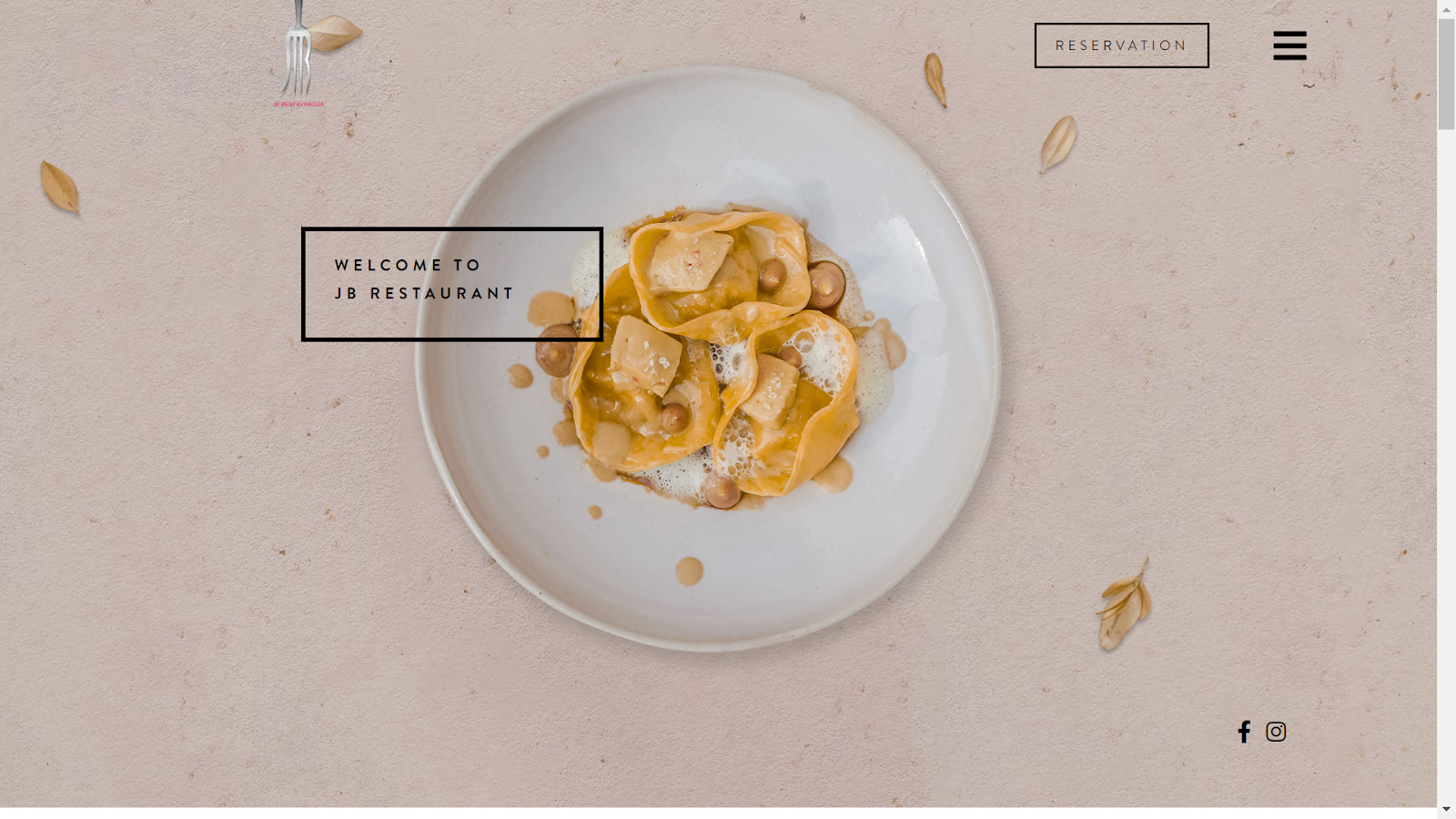
If your food is visually striking and you have (or are willing to pay for), some stunning photographs of your dishes, matching this design could be a great option.
Check it out here JB Restavracija
4) Darwin & Wallace
Darwin & Wallace make great use of their Instagram. All their bars are unique, so, instead of trying to force their website to match all the different aesthetics of their many locations, they have emphasized their bars’ individuality and focused on incorporating their ravishing Instagram feed instead.
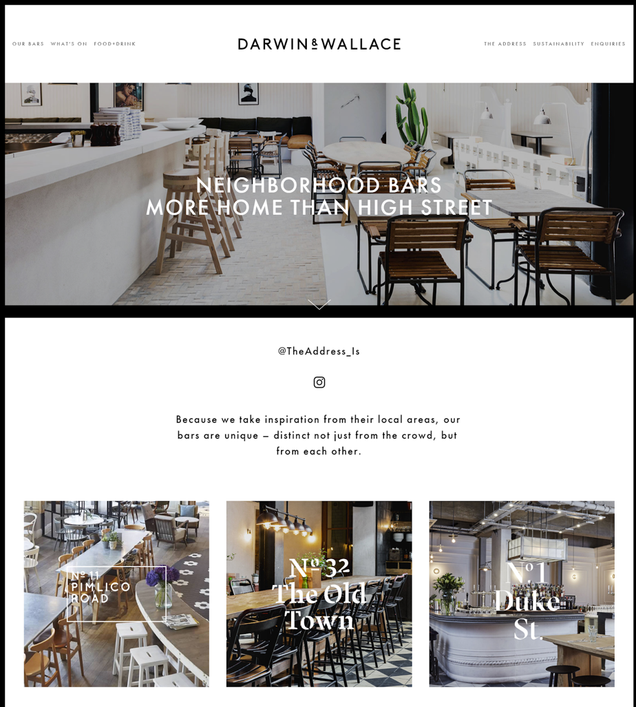
If your business is similarly diverse, this is a great way to still have a central website while allowing each individual location to shine.
Check it out here Darwin And Wallace
5) Bresca
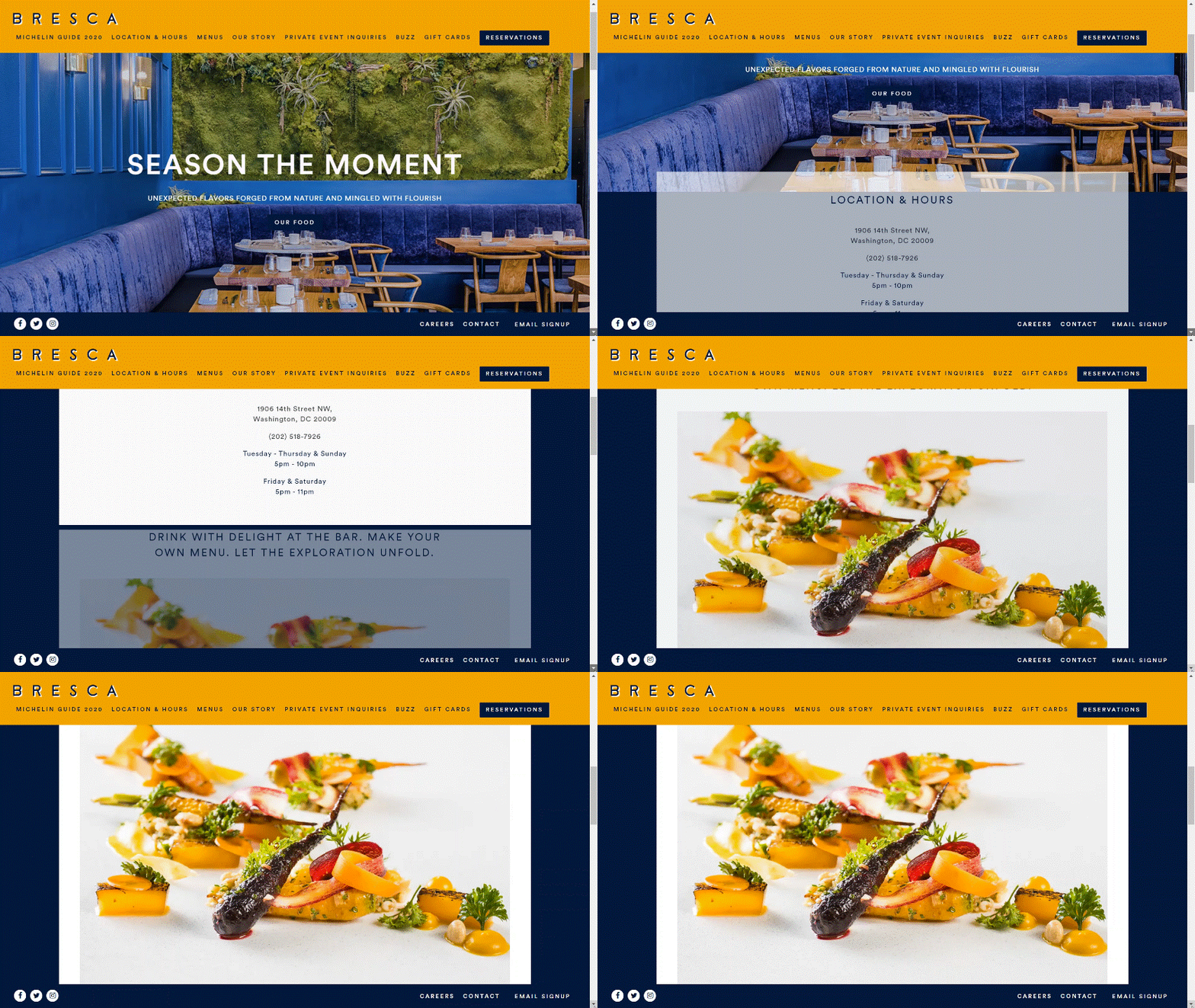
Bresca makes awesome use of subtle animation. As you scroll down the page, the boxes of information fade into view to meet you. This is a nice technique to grab the attention of the viewer without overwhelming them.
If you want to add a special touch to your webpage, use subtle animations to make your site stand out.
Check it out here Bresca
6) Restaurant Colibri – Cuisine Verte et Transparante
Another site that incorporates a lot of subtle animation is that of Restaurant Colibri who also use their website as an online marketplace. Clearly displaying pictures of food and prices, the site allows you to browse the menu and order what you want for takeaway or delivery. It also has a book now button that allows customers to book reservations online. All of this makes it super easy for customers to engage with their brand
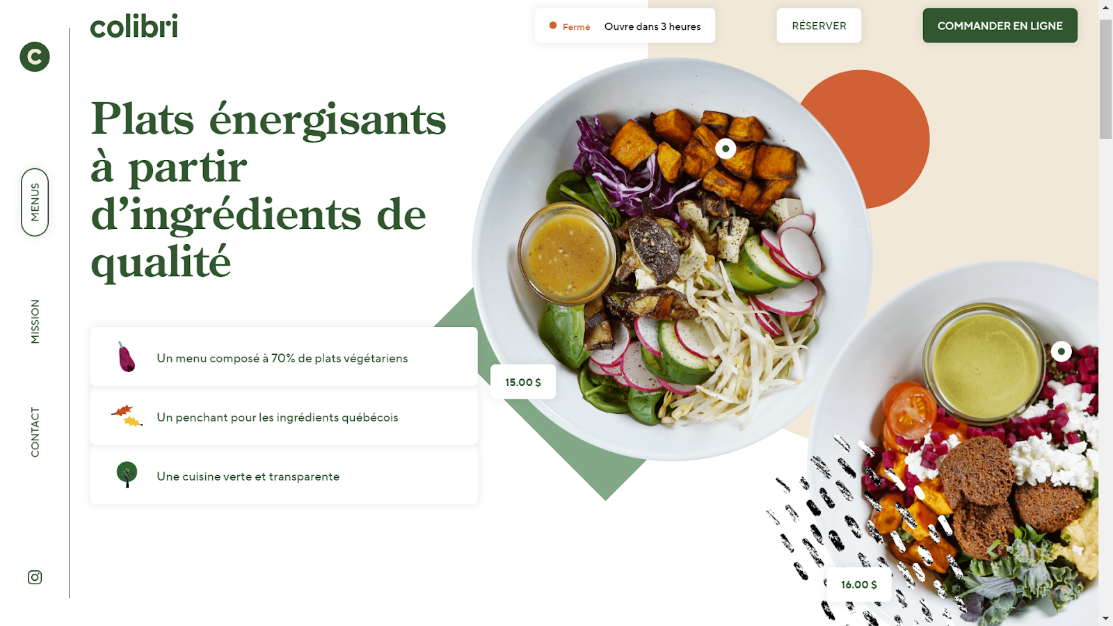
All the tech, combined with the prominent “mission” page, gives the brand a modern, forward-thinking feel, and this is a great investment for a business aiming at future rapid growth. However, this website probably cost a fair chunk to build – so this route certainly isn’t for everyone.
Check it out here Restaurant Colibri
7) Craft and Kitchen
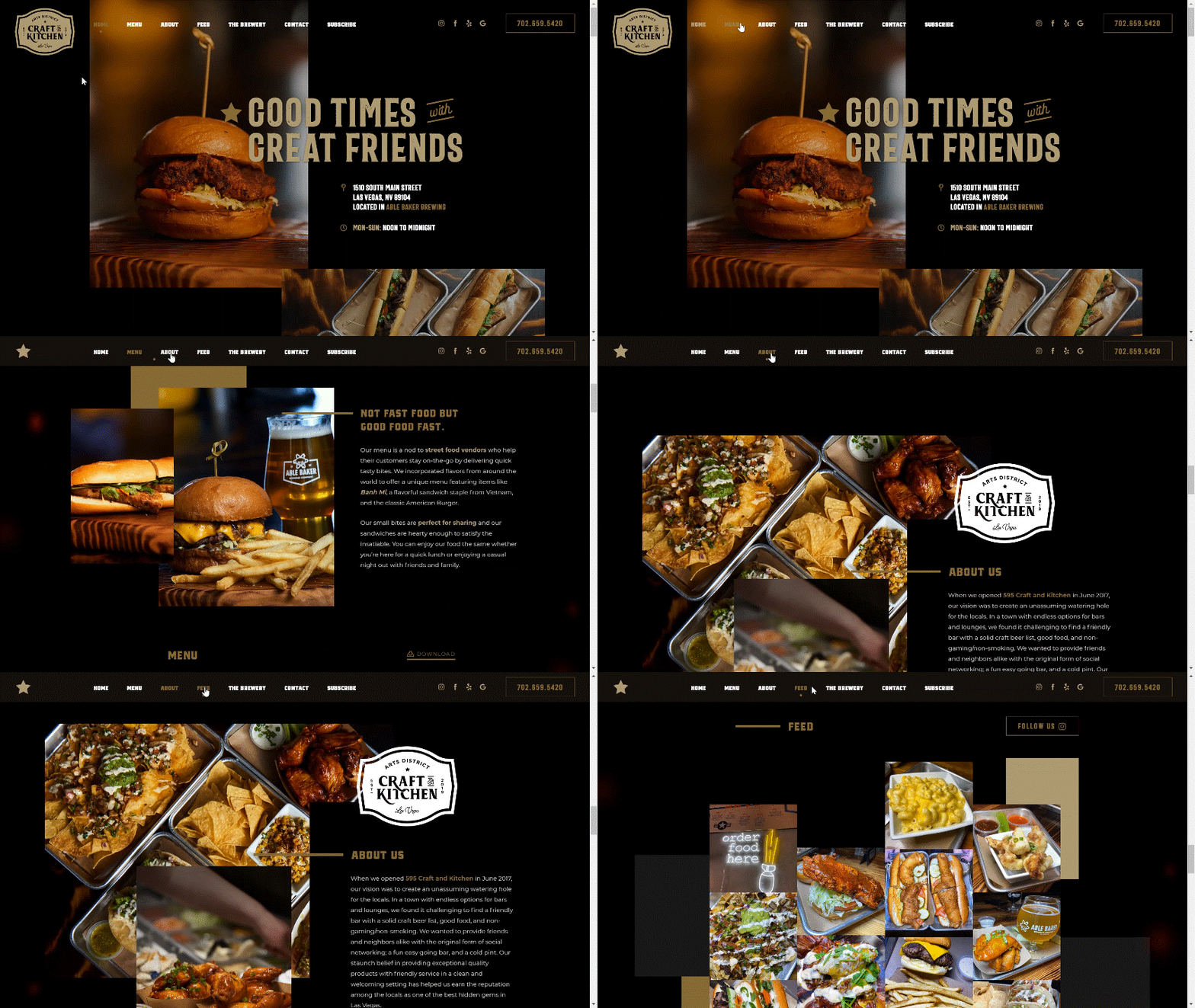
With an elegant and straightforward design, Art District Craft and Kitchen in Las Vegas places all the important links on the home page in a simple scrolling fashion. It makes the site very simple to navigate. The use of a darker background with white and gold lettering also makes the text easier to read. The menu at the top of the page also changes colour from white to gold once you reach that section of the page, that way you can’t get lost.
Placing everything on the home page and creating simple anchor points from the menu is a great way to make your website more user-friendly.
8) El Burro
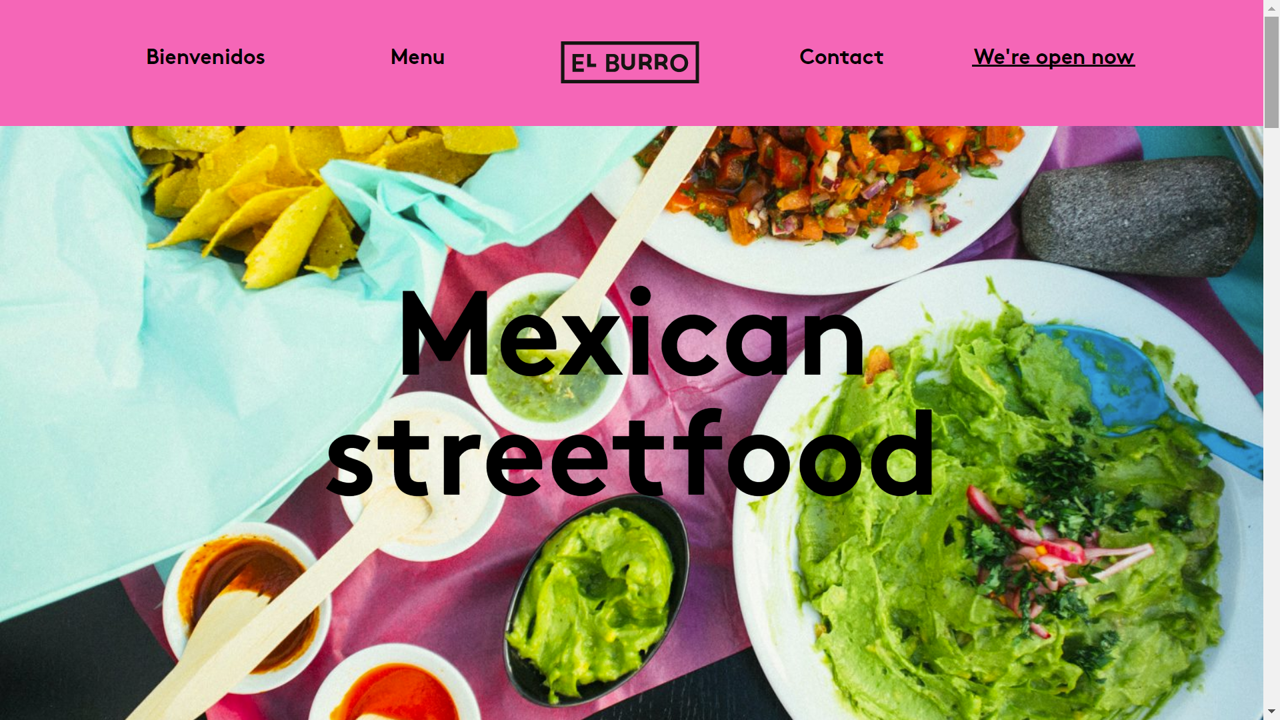
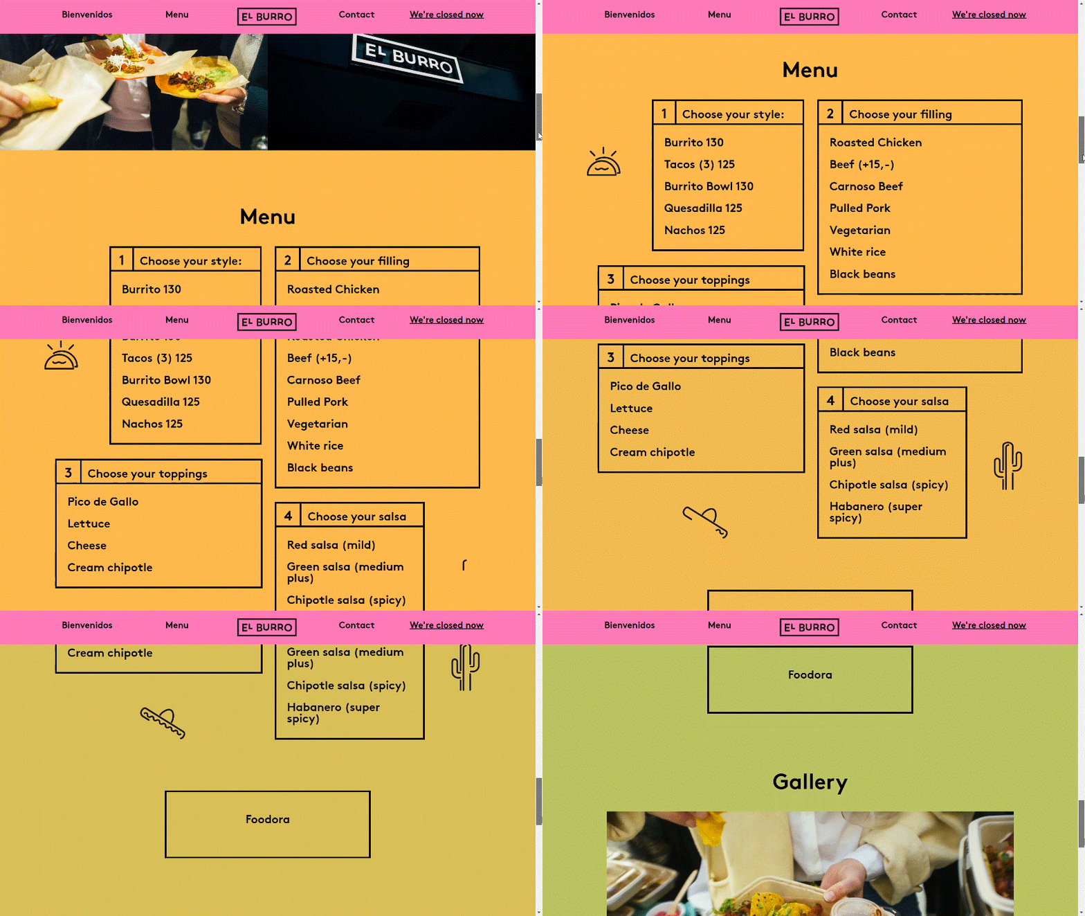
This Mexican street food restaurant in Oslo has one of the brightest and boldest websites I’ve ever seen. It uses the same simple formatting as Craft and Kitchen (above) with simple scrolling navigation, but in bright pinks, oranges and greens. The colours perfectly complement the pictures of their food and make them stand out from the pack.
Choosing the right colour palette for your site is important, but don’t limit yourself to what is classically appealing if it doesn’t match your vibe.
9) Quince Restaurant
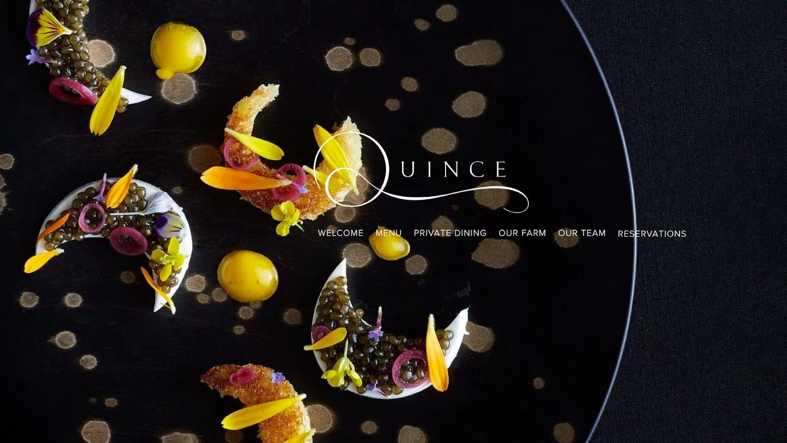
Quince Restaurant has a very minimalistic home page. It’s simply a beautiful image of a dish and links to their other pages. The setup alone reflects the elegance of the restaurant. It’s a great reminder that websites don’t always have to be overly complicated.
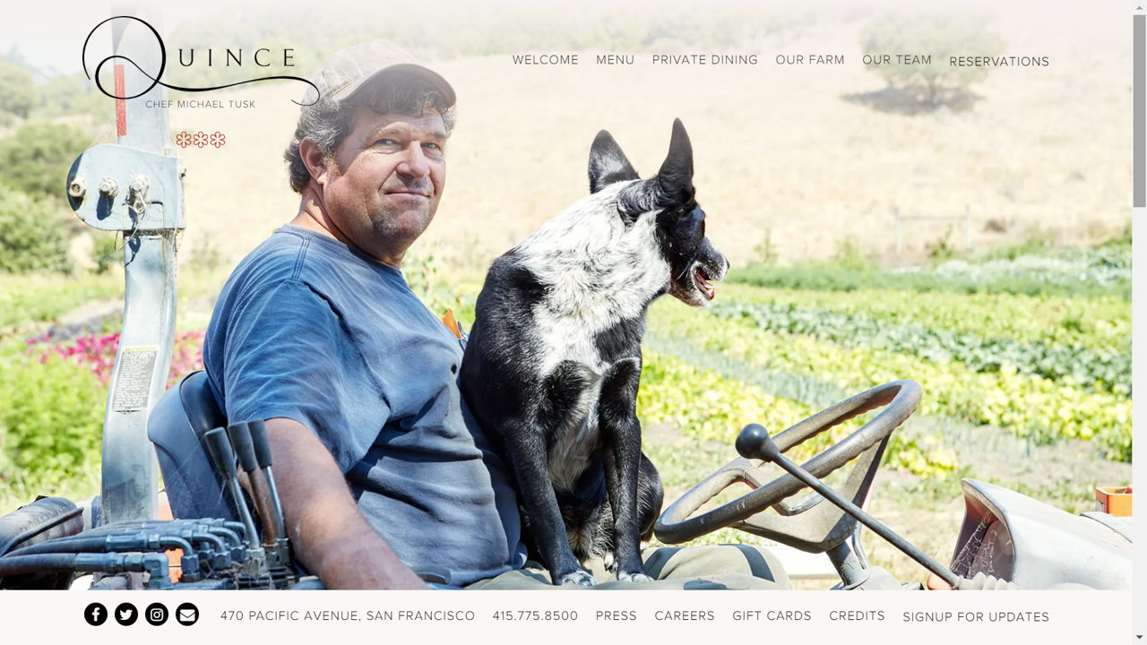
Their “our farm” page also does a great job of emphasizing their “farm-to-table” ethos with some beautiful rustic images. This a great example of how to give a solid nod to your values without overdoing it.
Check it out here Quince Restaurant
10) Pastaria
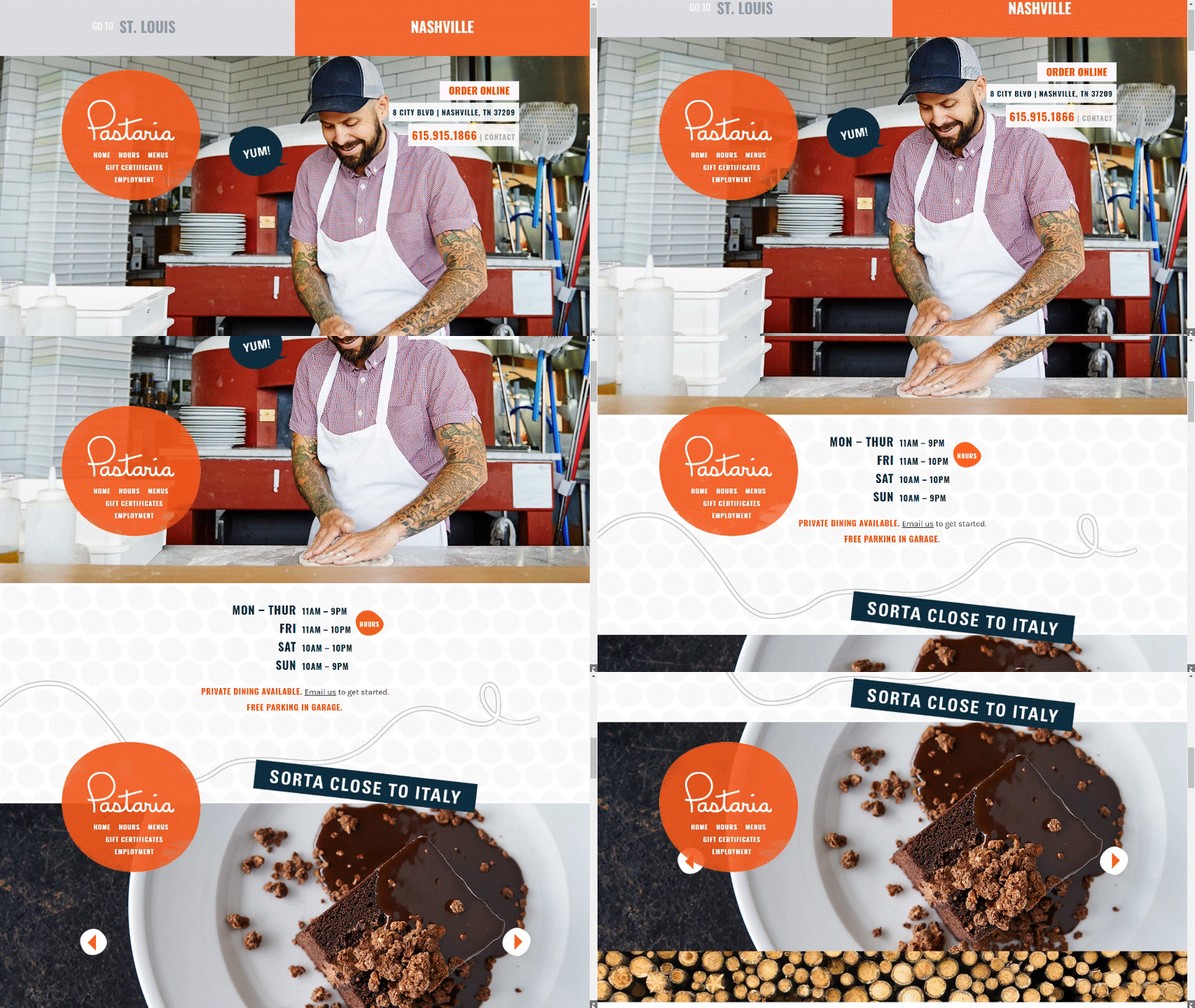
With a simple one-page design, Pastaria’s website is easy to navigate. To add to this ease, they included a permanent bubble navigation bar that stays on the screen as you scroll. Having your navigation bar readily available in the form of a bubble, topbar, or sidebar is a great idea. 65% of people look at the restaurant menu online before visiting, so if people can’t find your food, they won’t bother trying to find your restaurant. Make sure that doesn’t happen by making your navigation bar user-friendly.
They’ve also done a great job of getting across their cheeky, fun brand by popping in some humour here and there. Visitors to the site instantly get the impression that this will be a relaxed place to eat, drink, and have fun.
Check it out here Pastaria Nashville – A fresh approach to Italian dining
11) Sliders
Sliders in Copenhagen is a burger restaurant that aims to combine Tapas and great burgers. Their site sports a gorgeous white-on-black theme with gold accents and is relatively easy to use. But, what really makes it stand out is the menu.
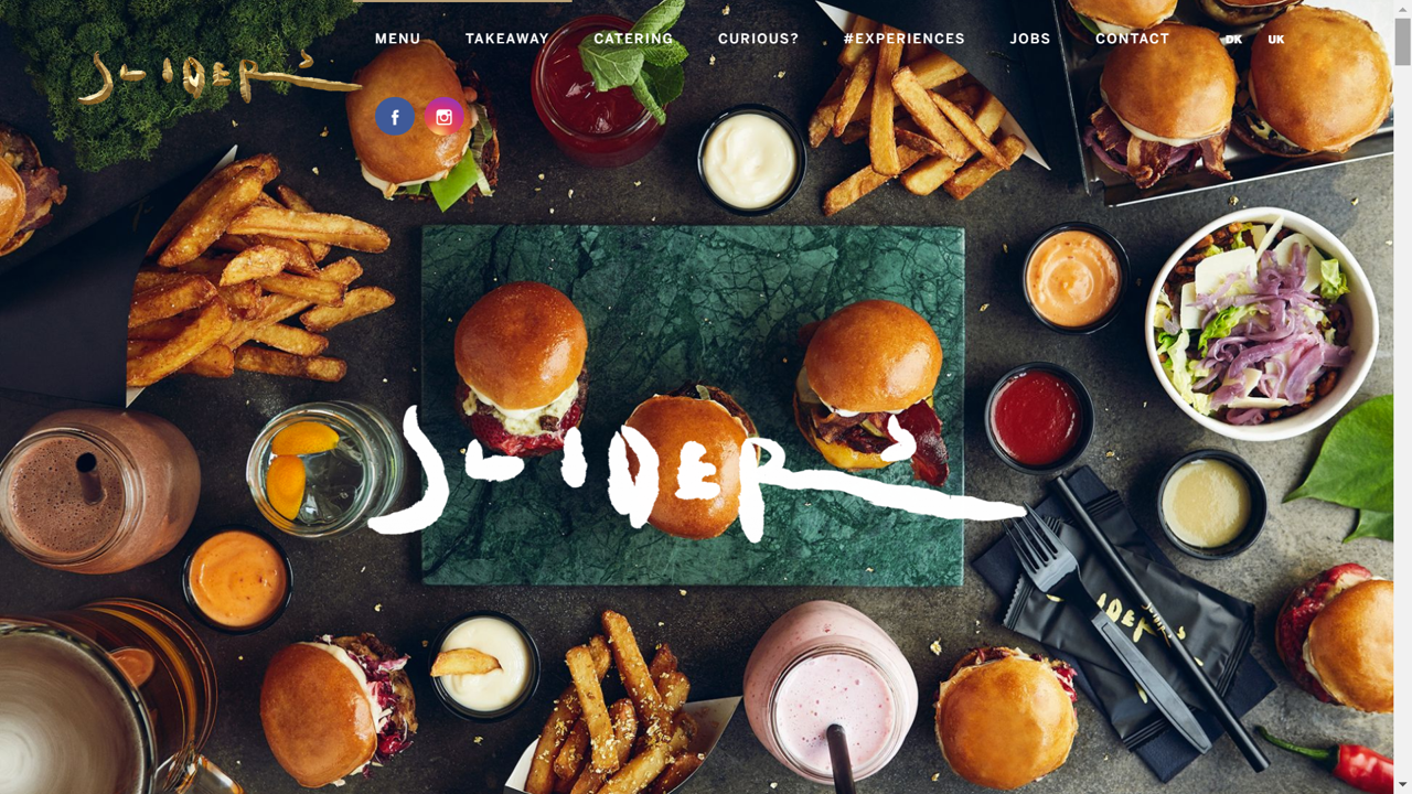
The menu is both a classic written menu and completely made up of pictures. As you scroll over the different menu items, the written description fades away to reveal a picture of the item. This is a great way to add both pictures and full descriptions of the food onto the menu without making the menu page too crowded.
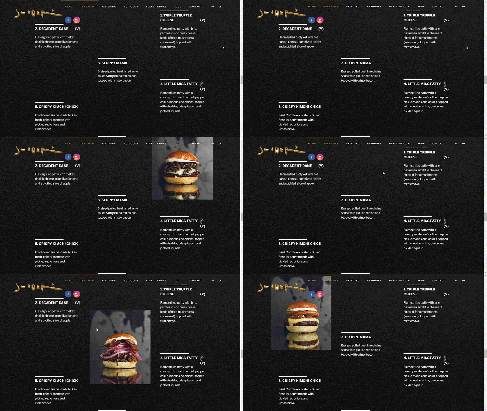
If you’re worried about adding pictures and full text to your website, this is the perfect solution. It has the added bonus of making your site more dynamic.
Check it out here Sliders
12) Middle Child
Speaking of dynamic, nothing makes a website stand out more than moving elements. As discussed with Bresca, adding animations to your website makes the site more interesting to explore. If you are interested in seeing a whole range of different types of animation you should look at Middle Child’s website.
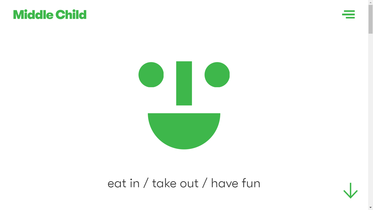
This Philadelphia restaurant uses scrolling text, a sandwich train, and a blinking logo to make their otherwise simple website a bundle of fun. It creates a playful, child-like feel that perfectly matches the brand name.
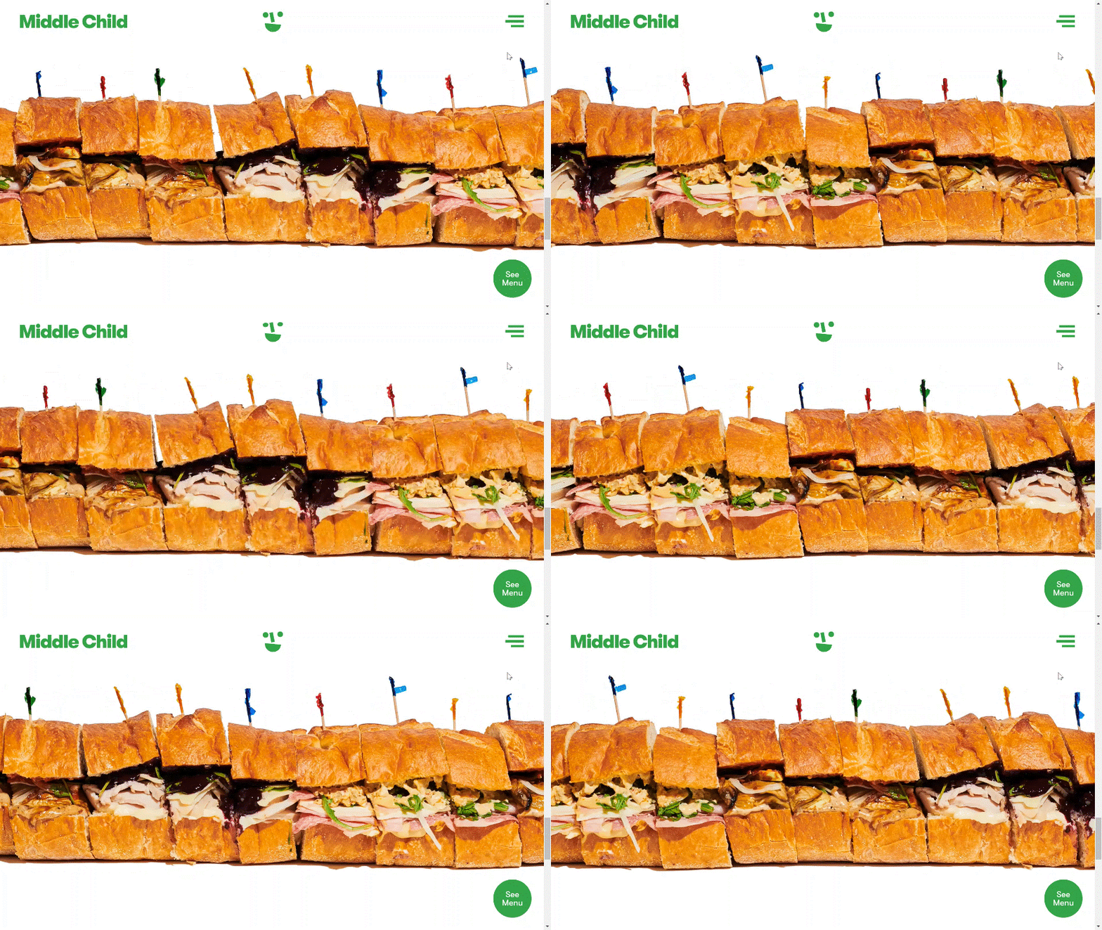
If you want to create a more fun-loving atmosphere, less subtle animations are the way to go.
Check it out here Middle Child
13) Malai Ice Cream and Cake
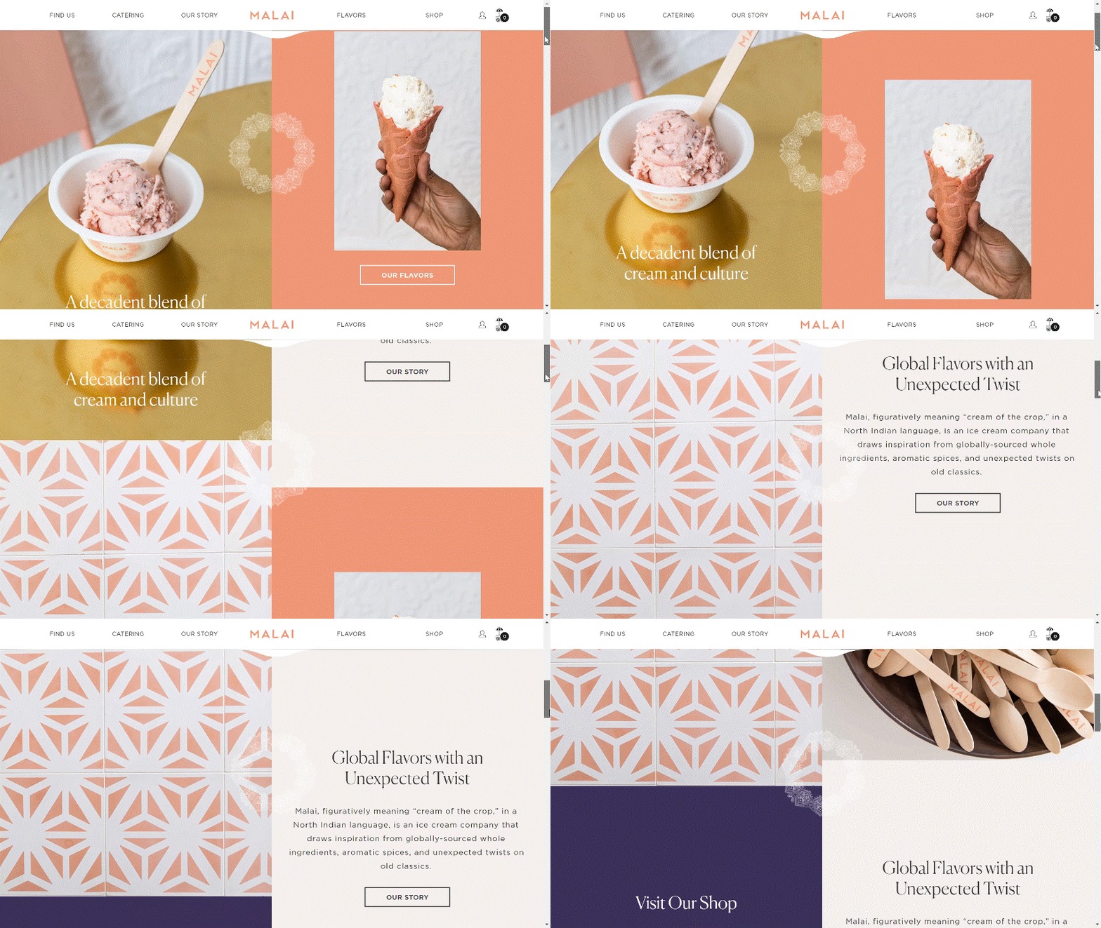
Malai Ice Cream and Cake is a chain headquartered in Brooklyn, New York, that uses South Asian flavours to inspire their unique desserts. Their website uses a scrolling animation that is both interesting and fun. The two halves of the screen move independently, one scrolling up, the other down, as you make your way down the page.
This page animation is more dynamic than simply fading in and out but doesn’t harm the viewer’s ability to read through the page. It’s a fun way to make your site stand out.
Check it out here Malai Ice Cream and Cakes
14) Top 2000 Online Café
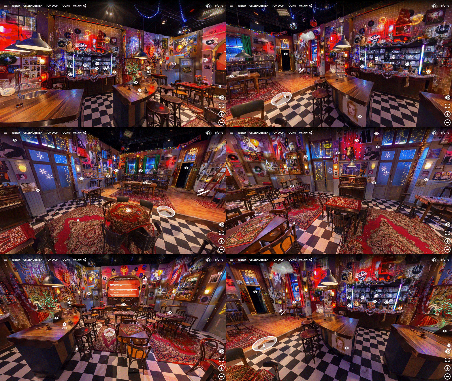
Okay, so it might not be a real place, but this fictional cafe’s site is so unique it’s worth including. A completely interactive 3-D space from the back of the bar to the second floor, there isn’t a single area that can’t be explored on this website.
If you have a truly unique and interesting space, the confidence expressed by making the experience available online could make your business feel like an iconic landmark. A gutsy strategy, but I can think of a few special places that could probably pull off this look.
Check it out here Top 2000 Online Café
15) Simmons Bar
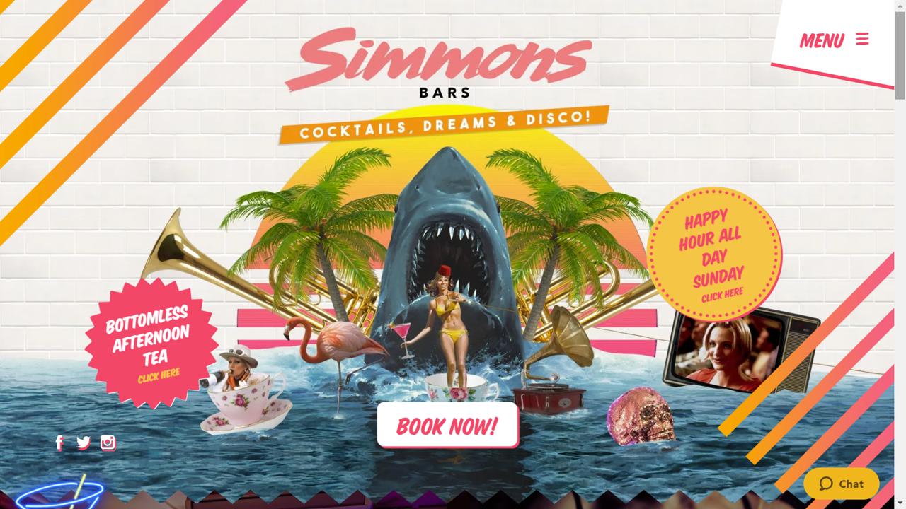
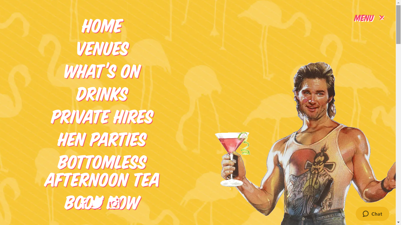
This website is a reminder to stay true to your brand’s theme, no matter how crazy it is. Simmons bar in London is definitely a place to go for a fun time. Their website is full of fun elements, from bright colours and fun drawings to a martini-drinking Kurt Russell cutout in the pulldown menu.
It doesn’t matter how crazy your restaurant or bar is, you can find the perfect way to present your brand online. Don’t be afraid of stepping out of the box.
Check it out here Simmons Bar
Conclusion
Building the perfect website can be a challenge. So, if you really find yourself at a loss for how to represent your brand online, take some inspiration from these fabulous examples. They all have great elements that really enhance the way their restaurants’ brands are presented.
Most of all, each site stays true to brand: reflecting and emphasising the uniqueness of the businesses’ values, food, and location. Lest we forget, the most important thing is…always be yourself.
