Restaurant Websites | The 15 best to get inspired by in 2026
A great restaurant website is harder to build than it looks. It has to be beautiful, functional, and fast all at once. And it matters more than you might think: 77% of diners check a restaurant’s website before deciding whether to visit, and nearly 70% have been put off by what they found.
These 15 however, have nailed that elusive balance to create the perfect tool to promote their restaurant brand.
Whether you’re redesigning or starting from scratch, feast your eyes and take notes!
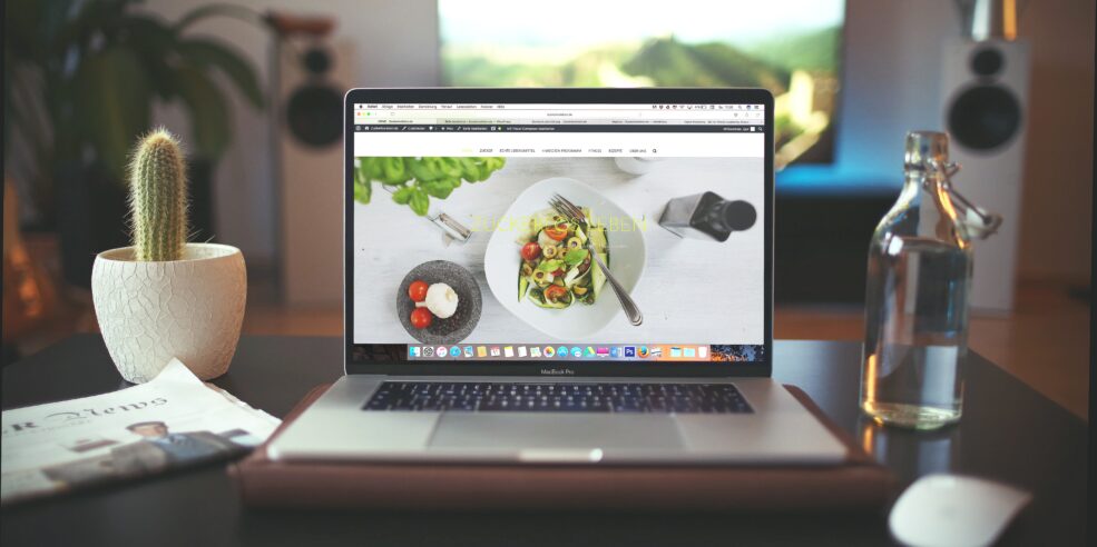
1) Warpigs
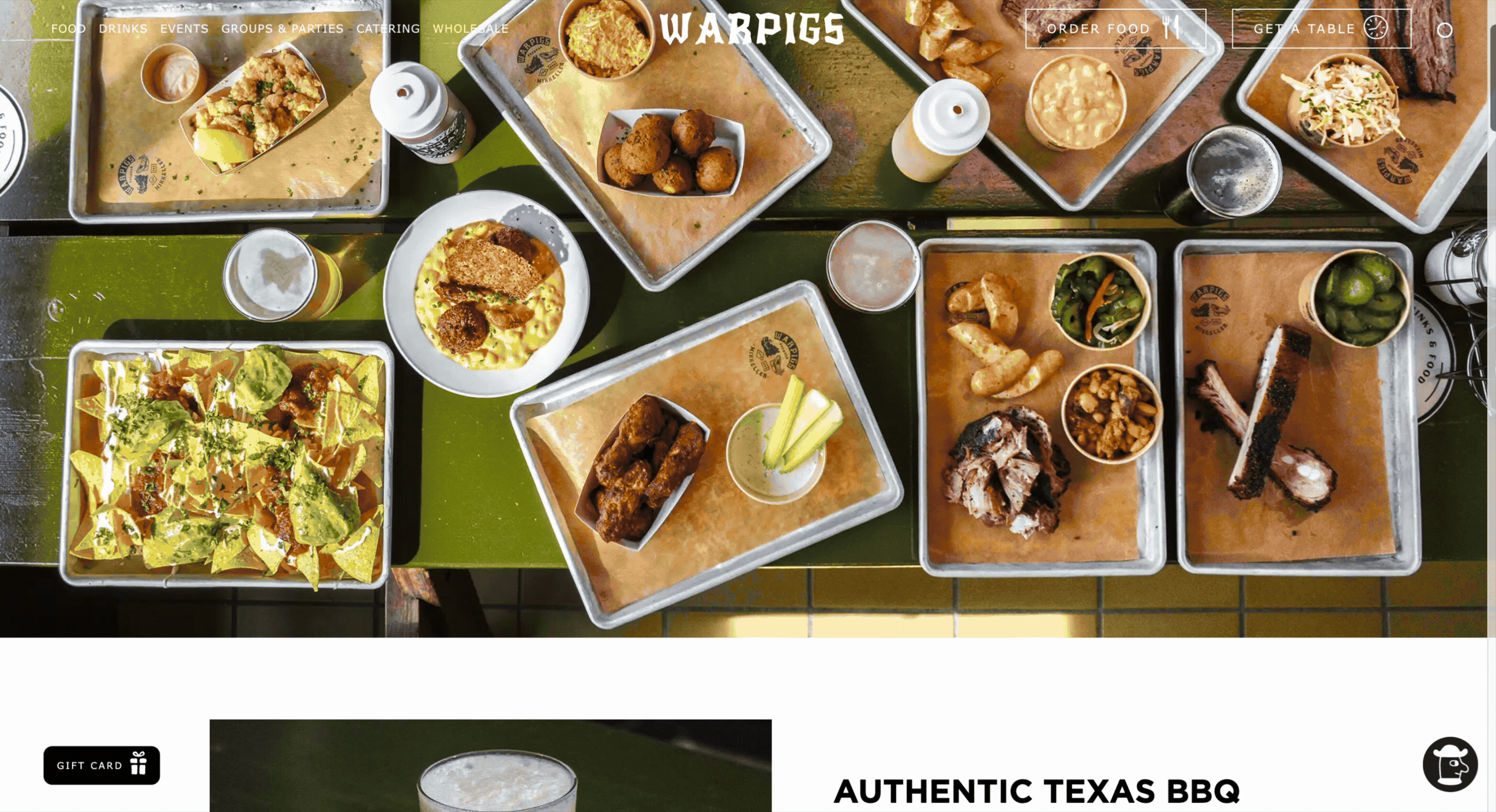
Warpigs, located in Copenhagen, creates a clean, modern and simple aesthetic by using a combination of welcoming, quality shots of food and recognisable typography. The most stand out feature here is an accessible main menu at the top of the page which stays as you scroll and expertly adapts to the background: when the background is dark in one area, the writing above will turn white and vice versa.
Other notable features are the dynamic shrinking of the logo into the top menu bar as you scroll, very pleasing! And not only is their branding strong through consistent font use, but also in the colour pallet that matches the restaurant’s interior design.
Warpigs call out their various dining options on offer too – restaurant, catering, delivery and events. This is the kind of business which will need to know it’s forecasted demand in relation to inventory and sales, every single day. Why not simplify your data aggregation as well as your website design?
Check Warpigs out here.
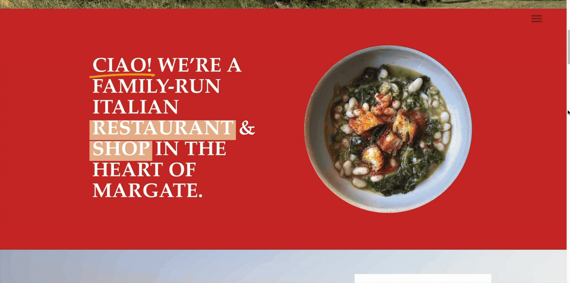
2) Bottega Caruso
Harry and Simona’s Bottega Caruso in Margate, is an homage to Simona’s family in the mountains surrounding Naples, Italy. With a clean and simple design, their website conveys that hearty feeling of a family-run business. They transport you straight to the Italian hills with warm, authentic imagery. Paired with a vibrant red and yellow colour palette and considered graphics (circling and underlining keywords and titles), this is a design that communicates a lot to the viewer, without needing to say much.
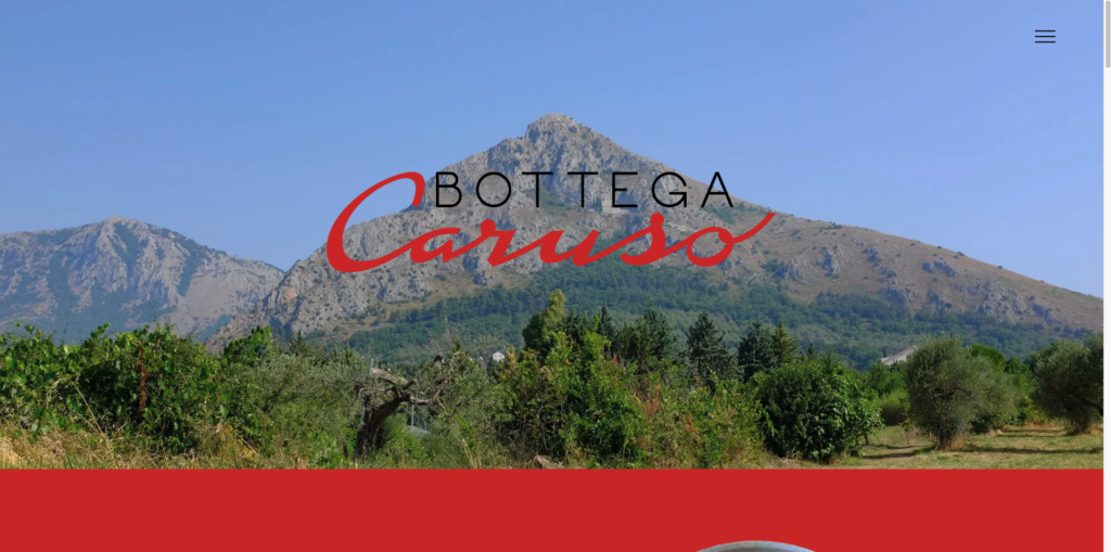
What they do really well here is lean on SEO practices and social media channels, perhaps unintentionally! 55% of diners will find their next dining spot on Google and with social media providing a new search channel too, it is best practice to optimise for both of these things. Caruso lean on SEO in their opening line using keywords such as ‘Italian Restaurant’ and ‘Margate’ to help direct Google to their page, whilst including an Instagram grid feature too.
Check it out here Bottega Caruso.
3) The Fat Duck
Heston Blumenthal, head chef at the Fat Duck, is world-famous for his innovative food – his dishes often hide delightful surprises – for example, a chicken liver and foie grass parfait which looks exactly like a mandarin orange. The Fat Duck’s website has been brilliantly designed to match this expectation.
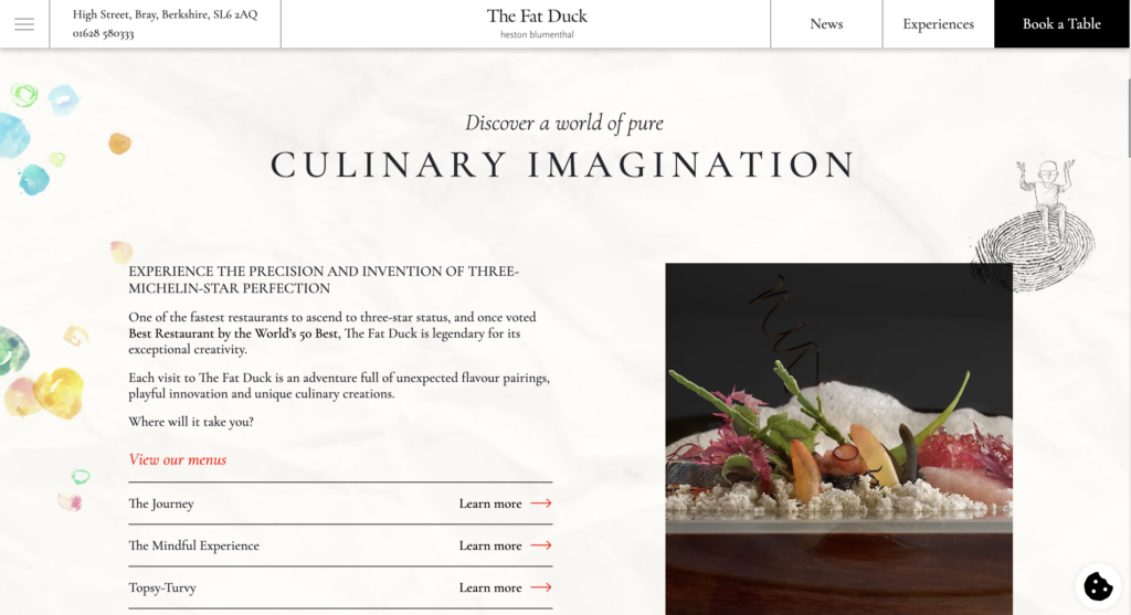
This website is a wonderful blend of sophistication and fantasy – just like Blumenthal’s culinary creations. Watercolour motifs, intricate drawings and architectural details, all lean on an ‘Alice in Wonderland’ style which captures the imagination of the visitor. As a well-known chef, the sophistication needs to be carried through too. This contrast of simple, almost plain font choice and elevated imagery, with the childlike drawings, allow both of these themes to perfectly coexist.
Check it out here The Fat Duck
4) Darwin & Wallace
When guests enter a website, they want an easy route to make a reservation. In fact 65% of diners will book directly through your website – so this needs to be an easy and clear process. Darwin and Wallace have done this well. By making their Book Now button front and centre, followed by a seamless in-website integration that shows all available times, days and venues, this is a website that knows how to convert visitors.
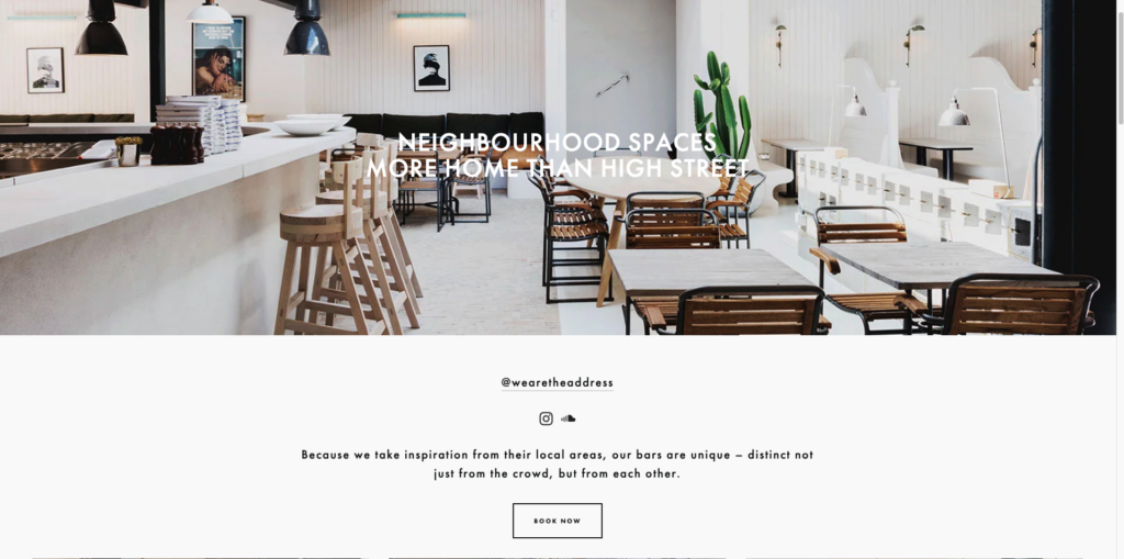
Not only this, but they make great use of their Instagram. All their bars are unique, so, instead of trying to force their website to match all the different aesthetics of their many locations, they have emphasised their bars’ individuality and focused on incorporating their ravishing Instagram feed instead.If your business is similarly diverse, this is a great way to still have a central website while allowing each individual location to shine.
Check it out here Darwin And Wallace
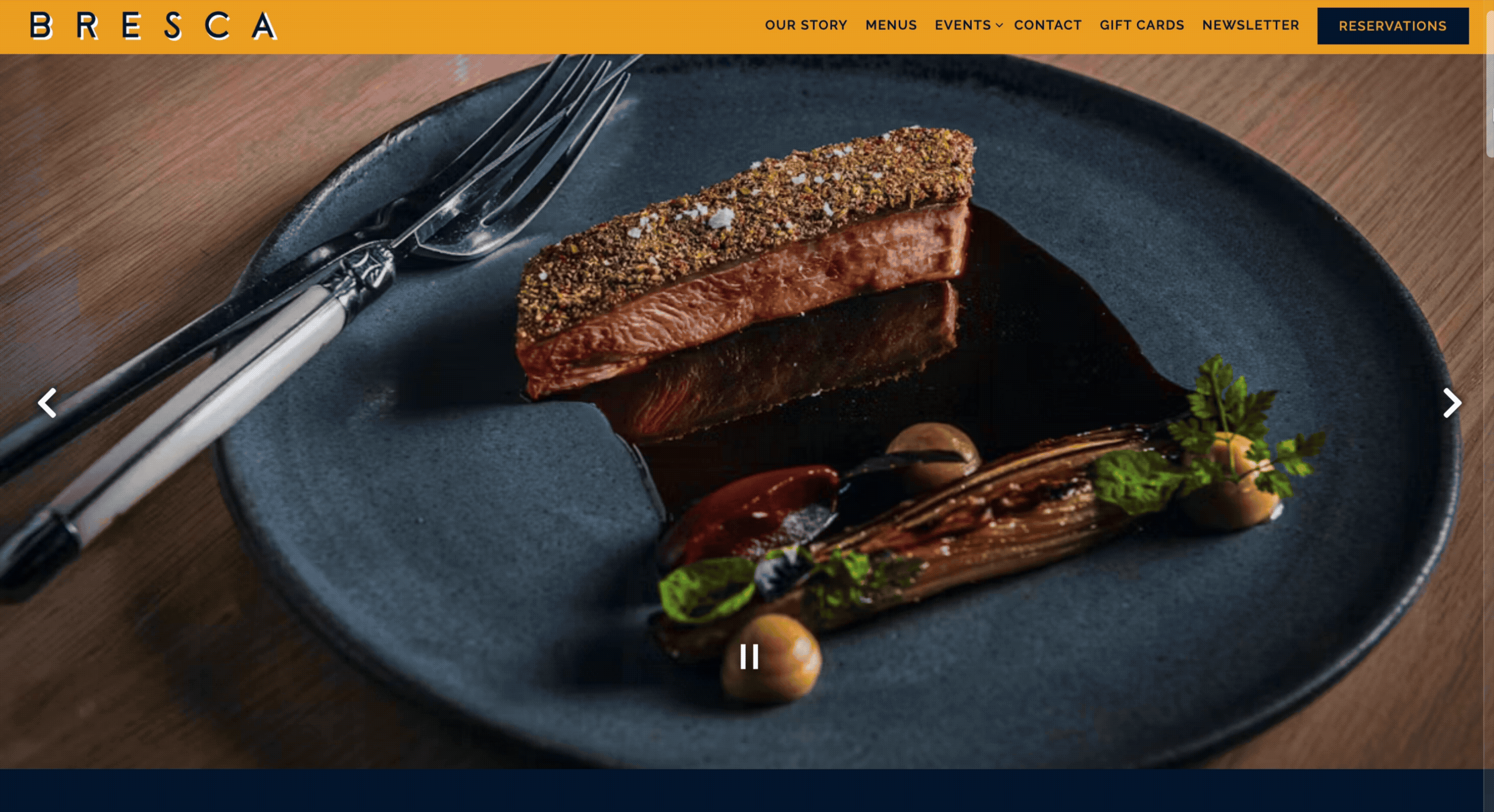
5) Bresca
Bresca makes an awesome continuity use-case. As you scroll down the page, a background image stays still as boxes move over the top. This is a nice technique to keep the attention of the viewer without overwhelming them.
If you want to add a special touch to your webpage, subtle animations and smooth flows make your site stand out and a calm place for the visitor to be.
Check it out here Bresca
Inspired to improve your restaurant performance?
It’s time you had full visibility of your data all in one place.
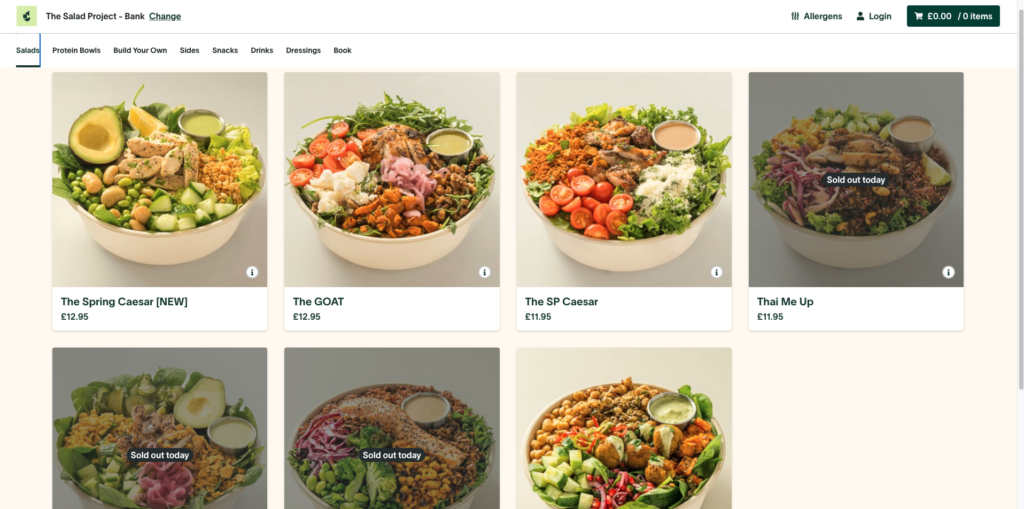
6) The Salad Project
Another site that incorporates a lot of subtle animation is that of The Salad Project who also use their website as an online marketplace. Clearly displaying pictures of food and prices, the site allows you to browse the menu and order what you want for takeaway or delivery. Unlike other brands we have seen, this website has 2 seperate menu bars; one for type of service (pick-up, delivery, catering) and another that provides an overview of their offerings such as food, stores and a rewards programme. All of this makes it super easy for customers to engage with their brand.
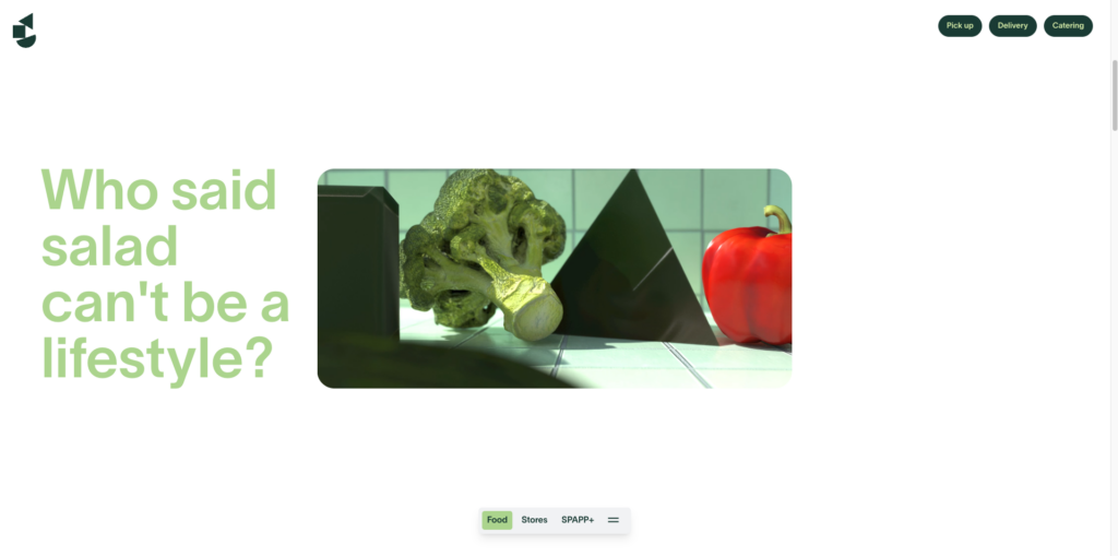
This website has a satisfying flow thanks to the dynamic animations of the menu bars and the opening page. They speak through detailed menu descriptions and interspersed photographs of their salad bowls – there is nothing left to the imagination which is exactly as you’d like!
Check it out here The Salad Project
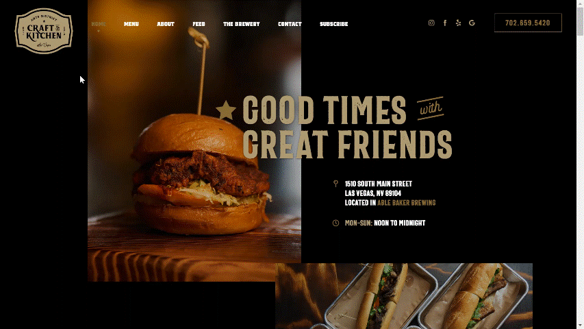
7) Craft and Kitchen
With an elegant and straightforward design, Art District Craft and Kitchen in Las Vegas places all the important links on the home page in a simple scrolling fashion. It makes the site very simple to navigate. The use of a darker background with white and gold lettering also makes the text easier to read. The menu at the top of the page also changes colour from white to gold once you reach that section of the page, that way you can’t get lost.
Placing everything on the home page and creating simple anchor points from the menu is a great way to make your website more user-friendly.
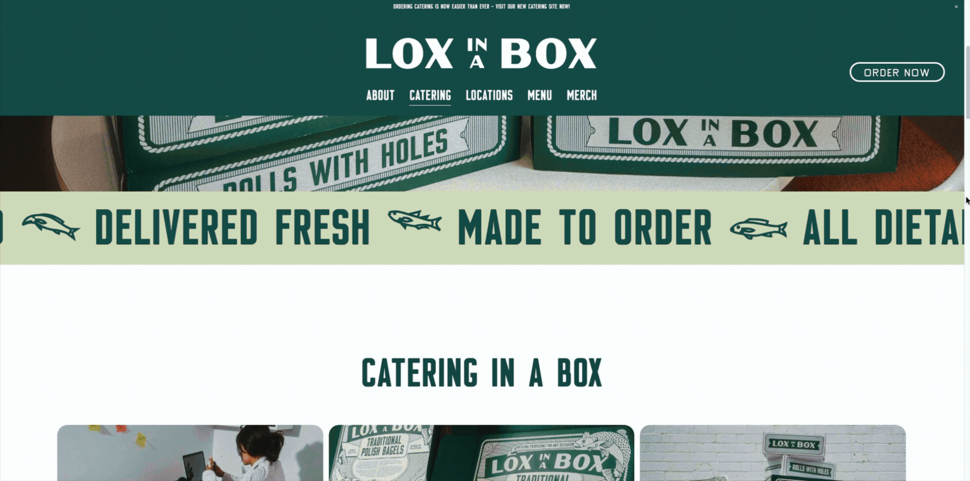
8) Lox in a Box
This Polish bagel lunch spot in Australia has a real retro feel that is consistent from website to venue. Similar to Bottega Caruso, they have a refined colour way which runs throughout, including in the imagery – and it is this imagery that they lean on for their main communication strategy throughout the site.
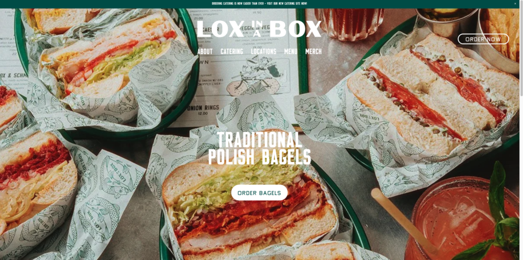
If we look at their catering page, this is a great example of how Lox use photography, subtle animations and clear headings to engage and signpost the visitor and ultimately entice them into their venues.
It is also worth mentioning the reviews banner at the bottom of this page. Reviews are an excellent way to signal trust to other customers, but not enough businesses are actually comparing their reviews with their sales data on a day-to-day basis. Understanding customer insights vs. sales can provide an insightful outlook on performance – this is valuable data that should not be overlooked.
Check out Lox in a Box.
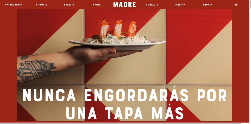
9) Madre Taberna Moderna
Bold imagery, clear text and stunning photography. At first glance Madre Taberna in Barcelona, by the No Hay Mañana group, are not doing anything wildly different to our other examples.
But what we do want to point out, is how the menu is written directly on the web page and doesn’t send you to a pdf download in a different window or tab. Why is this so great? Well when a visitor has read the menu and decided they love what they see, you want to make it as easy as possible for that same person to make a reservation. By reducing the need to go back to the website and search for a reservation point, you are making that conversion point a little bit easier.
Madre Taberna allow the visitor two easy options to do this once they have scanned the menu. 1, a ‘Make a booking’ call-to-action at the bottom of the same page, and 2, a permanent menu bar at the top that has a ‘Reservations’ option too.
Reservation ease on your website is one thing, seeing all your reservations data against your sales, reviews and inventory data is another. This should be common practice for your operations and Tenzo can help you to see your complete restaurant performance picture.
Check it out here Madre Taberna Moderna
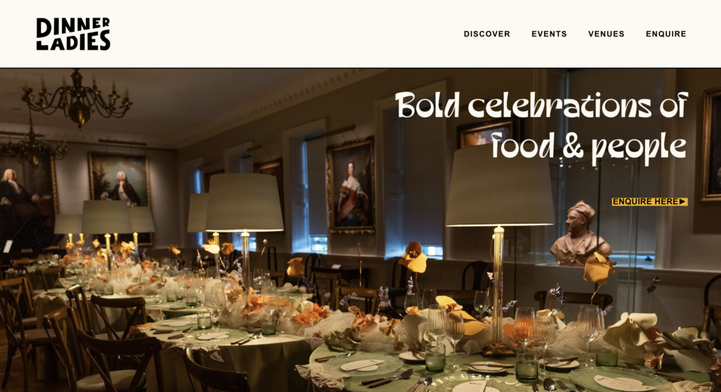
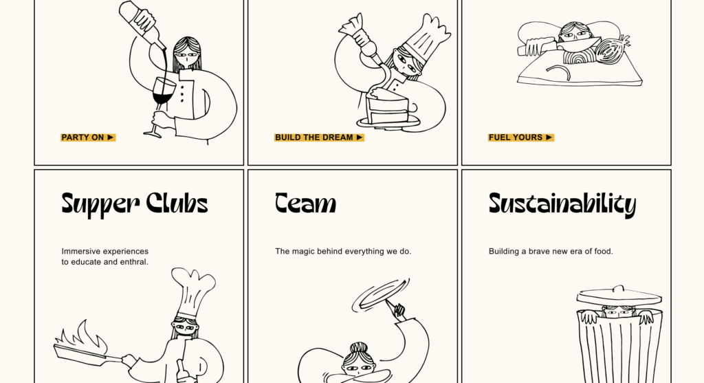
10) Dinner Ladies
Female-led catering and events business Dinner Ladies offer a mix of sophisticated animations, gorgeous imagery, and bold text that informs the visitor of their capabilities without ever feeling overwhelming. The colour palette is succinct, the fonts are clear, and the spacing allows for a seamless reading experience.
What really sets this design apart is the use of bespoke illustrations. These doodles are descriptive in themselves, giving the visitor the option to either read or simply “look” – it’s an intuitive way to guide a busy event planner through a service offering without forcing them to work for the information.
Beyond the visuals, Dinner Ladies are doing SEO right. For a catering agency, discoverability is everything. By using well-segmented, descriptive text, they ensure that search engines and LLMs can easily identify their niche and surface them to the right leads. It’s a reminder that your copy needs to work just as hard for the Google crawlers as it does for the human visitor.
Check out Dinner Ladies here.
Website design sorted? But you still don’t have full visibility of your data?
Understand your performance with full clarity now.
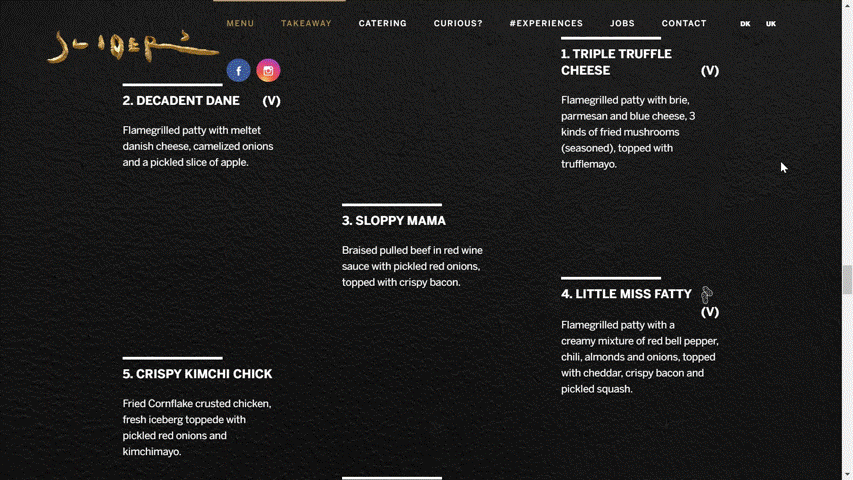
11) Sliders
Sliders in Copenhagen is a burger restaurant that aims to combine Tapas and great burgers. Their site sports a gorgeous white-on-black theme with gold accents and is relatively easy to use. But, what really makes it stand out is the menu.
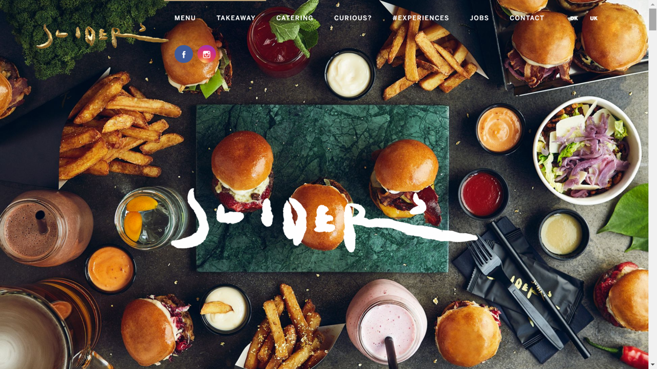
The menu is both a classic written menu and completely made up of pictures. As you scroll over the different menu items, the written description fades away to reveal a picture of the item. This is a great way to add both pictures and full descriptions of the food onto the menu without making the menu page too crowded.
If you’re worried about adding pictures and full text to your website, this is the perfect solution. It has the added bonus of making your site more dynamic.
Check it out here Sliders
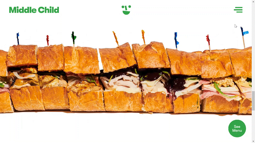
12) Middle Child
Speaking of dynamic, nothing makes a website stand out more than moving elements. As discussed with Bresca, adding animations to your website makes the site more interesting to explore. If you are interested in seeing a whole range of different types of animation you should look at Middle Child’s website.
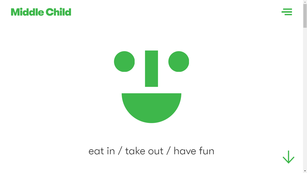
This Philadelphia restaurant uses scrolling text, a sandwich train, and a blinking logo to make their otherwise simple website a bundle of fun. It creates a playful, child-like feel that perfectly matches the brand name.
If you want to create a more fun-loving atmosphere, less subtle animations are the way to go.
Check it out here Middle Child
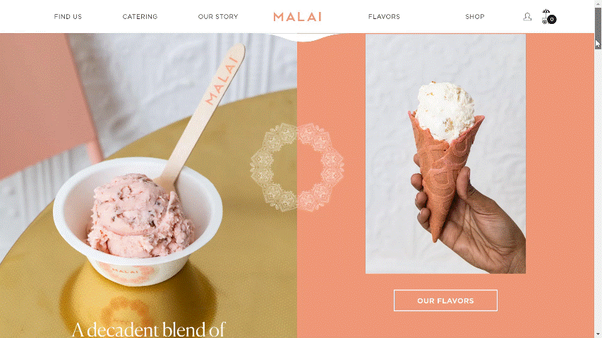
13) Malai Ice Cream and Cake
Malai Ice Cream and Cake is a chain headquartered in Brooklyn, New York, that uses South Asian flavours to inspire their unique desserts. Their website uses a scrolling animation that is both interesting and fun. The two halves of the screen move independently, one scrolling up, the other down, as you make your way down the page.
This page animation is more dynamic than simply fading in and out but doesn’t harm the viewer’s ability to read through the page. It’s a fun way to make your site stand out.
Check it out here Malai Ice Cream and Cakes
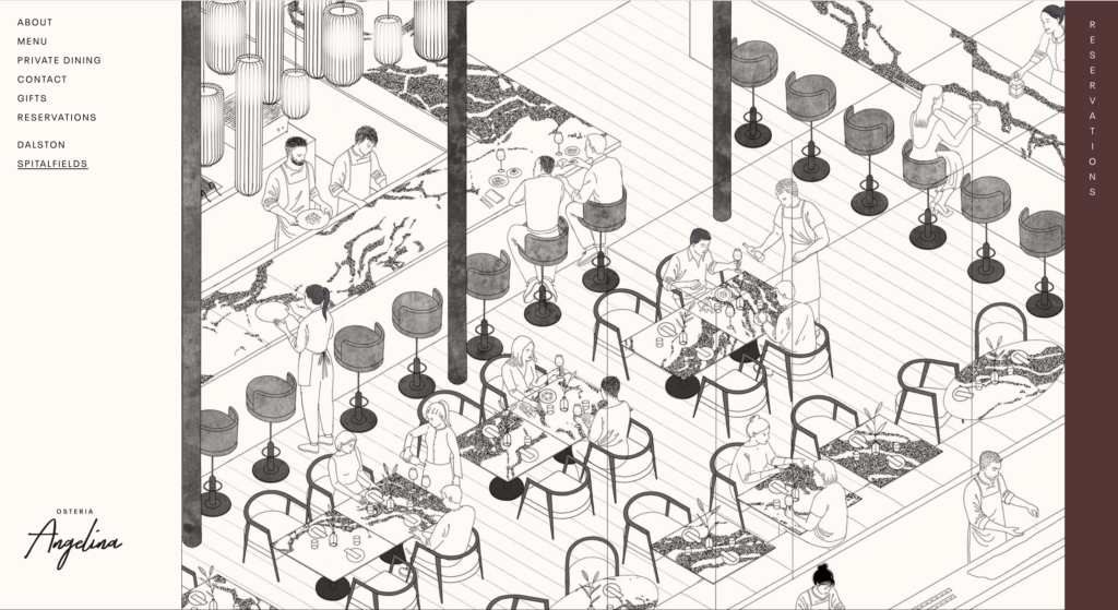
14) Osteria Angelina
Sister to Angelia restaurant in Dalston, Osteria Angelina’s website design has a wonderful simplicity. The initial illustrative view we have of the restaurant floor, brings a calmness and sense of understanding to the page visitor. The ambience is immediately portrayed and conveyed inexplicitly to the public – this is a venue that knows what they do well.
Scroll down the page and that elegant simplicity is continued with a pleasing text and quality photo divide down the page. What is particularly enjoyable is the smooth swipe of the reservations panel as it opens across the full page – another really easy process of converting page visitors to diners without blockers.
Easy to navigate, easy to interpret and above all, the brand values run strong.
Check it out here Osteria Angelina.
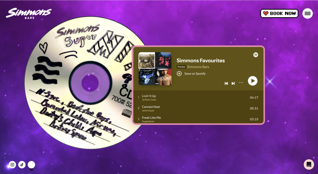
15) Simmons Bar
This website is a reminder to stay true to your brand’s theme, no matter how crazy it is. Simmons bar in London is definitely a place to go for a fun time. Their website is full of fun elements, from bright colours and fun drawings to a scull on the main page that follows your cursor – a very fun feature that immediately engages a visitor.
Every scroll reveals a new retro-themed layer, matching the same level of crazy that Simmons Bars are known for. The website is actively advocating for a good time with engaging graphics and recognisable features: Rock ‘n’roll mouth, Pacman features, polaroid-style images, a spinning CD… the list goes on!
It doesn’t matter how crazy your restaurant or bar is, you can find the perfect way to present your brand online. Don’t be afraid of stepping out of the box.
Check it out here Simmons Bar
Conclusion
Building the perfect website can be a challenge. So, if you really find yourself at a loss for how to represent your brand online, take some inspiration from these fabulous examples. They all have great elements that really enhance the way their restaurants’ brands are presented aesthetically.
The biggest thing to consider: your customer journey. Is it easy to navigate? Is it easy to make a reservation? Will Google find your website from keywords? And operationally, are you ensuring all this reservation data, reviews data and stock data is being seen together so you can understand how you are performing?
Finally, tune into the social scape and understand what you are known for by the public, not what you wish you were known for! Most of all, each site stays true to brand: reflecting and emphasising the uniqueness of the businesses’ values, food, and location. Lest we forget, the most important thing is…always be yourself.